Sake Flight Card
Design
for Japanese Restaurant
HAKATA TONTON
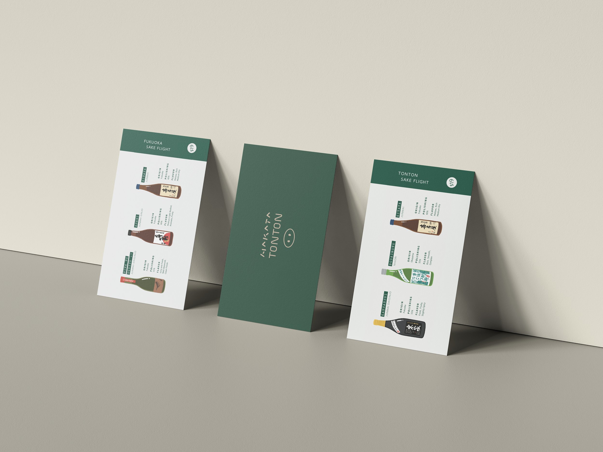
To capture the restaurant’s unique and charming atmosphere, the card design was completed with colorful illustrations of sake bottles.
To ensure that the details of each sake bottle were not overlooked, a wide range of colors was used. The illustrations were created using color alone, without outlines, to convey a smooth, seamless look. To provide a clear view of the three types of sake, they were arranged in a linear layout with corresponding information organized in a clean and orderly manner.


